Colour in terrazzo is not painted on but cast through. Understanding how pigment, binder and aggregate conspire is the difference between a palette that pleases and one that endures.
To choose colour in terrazzo is to think differently about colour itself. There is no paint here, no surface tint to be reapplied when the years dull it. The hue lives within the material, dissolved through the very two-component binder that holds the aggregate together, set permanently the moment the resin cures and locked there for the life of the surface. This is colour as substance rather than coating, colour you could in theory cut through and still find, and it asks for a designer's eye trained on depth as much as on shade. Approached as if it were paint, terrazzo will disappoint; approached as a solid coloured material, it offers a richness few other surfaces can rival.
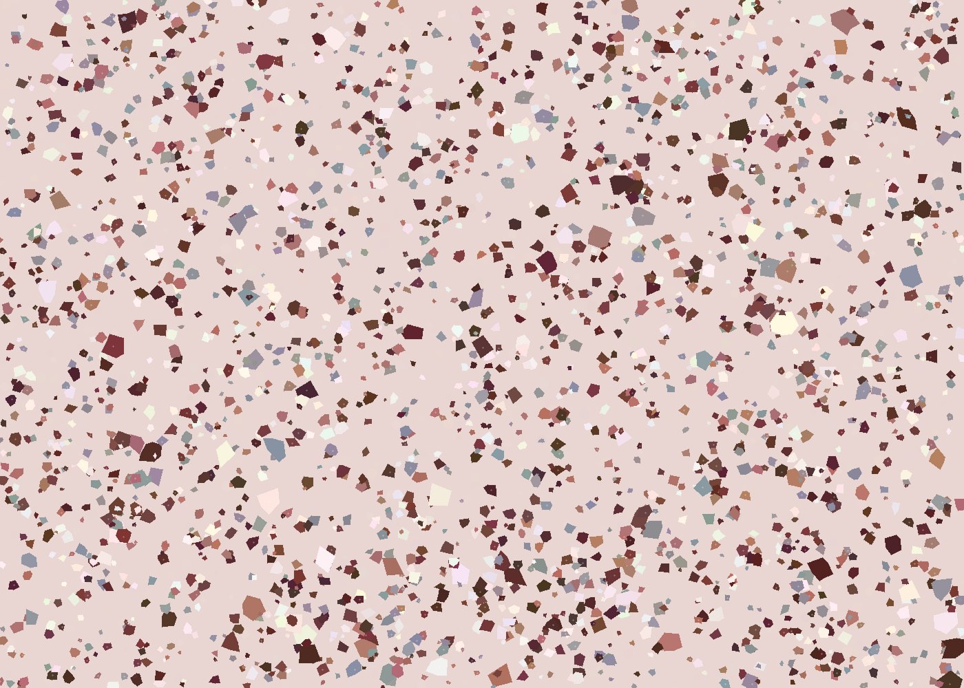
An epoxy terrazzo surface carries its colour in two conversing layers. First is the pigmented binder, the two-component epoxy field tinted with stable colourants to form the background against which everything else reads. Second is the aggregate, the marble, glass, granite or shell whose own colours punctuate, contrast or harmonise with that field. The final impression is the product of both, perceived together as the eye blends matrix and stone at viewing distance.
In terrazzo, the background colour is a decision as consequential as the aggregate; designers who treat the binder as mere filler forfeit half their palette.
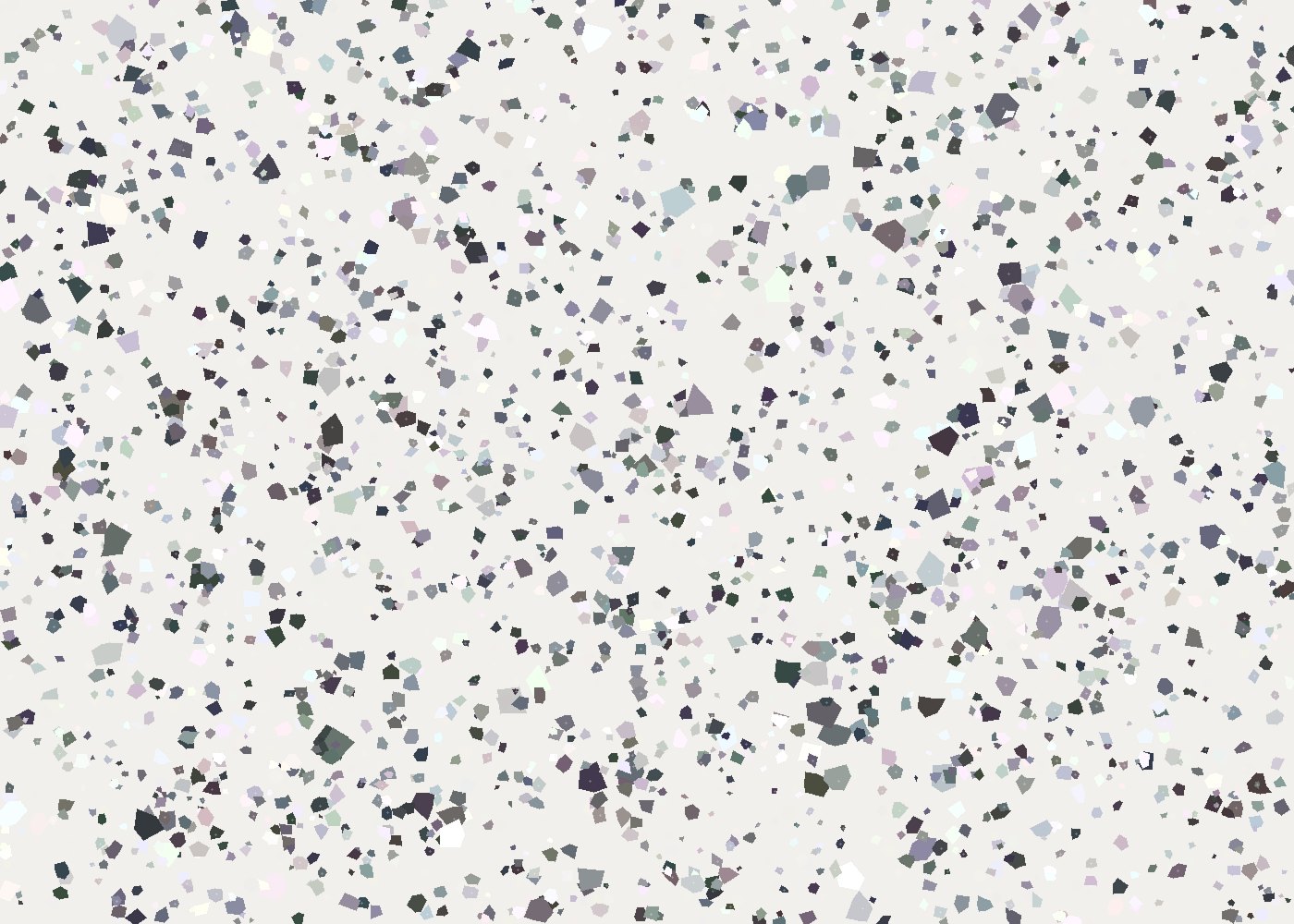
This layered nature is the material's great expressive gift. A pale binder lets aggregate flecks float and sparkle; a deep, saturated binder swallows light and makes the aggregate glow like embers. The same stones can read entirely differently against different grounds, which is why sampling at scale, in the real light of the room, is indispensable.
Permanence of colour is not automatic; it is specified. Pigments must be chosen for their fastness, and the topcoat for its resistance to ageing.
Colour carries feeling, and in a poured floor that feeling is unavoidable underfoot. Warm terracottas and ochres lend intimacy and grounding; cool greys and greens bring composure and space; deep charcoals and inks confer drama and weight; soft creams and whites open a room and let the aggregate take the lead. Because the surface is often vast and continuous, its colour sets the emotional key for everything placed upon it.
Our advice is to begin with the binder, not the aggregate. Establish the ground tone the space needs, the emotional key the room should sound, then select aggregate to animate and complicate it, rather than falling for a tray of pretty stones and hoping a background can later be found to suit them. Consider, too, how the colour will behave by day and by artificial light, since terrazzo is walked on at every hour and a hue that sings at noon can turn cold and grey under evening lamps. And resist the temptation toward the loud or the trend-bound. A floor is a long commitment, far longer than the wall colour or the furniture above it, and the most satisfying terrazzo palettes tend to be those that recede confidently into the architecture rather than competing with it for the eye.
The most refined results often come from disciplined palettes: a considered binder, two or three aggregates in conversation, and a finish chosen to flatter both. Colour handled this way does not shout for attention; it rewards it. Cast through the body of the material and protected by a UV-stable topcoat, that colour will hold true for decades, looking in its thirtieth year much as it did in its first. In terrazzo, to design with colour is to design with time.
Once dismissed as institutional flooring, terrazzo has returned as a signature of considered luxury. We trace the revival and explain why designers cannot put it down.
Read article→
Hospitality asks a surface to be beautiful, durable, safe and endlessly walked upon. Terrazzo answers all four, which is why it has become the material of arrival.
Read article→
Beyond the floor, terrazzo has become a material for objects: kitchen countertops, vanities, tables and seating. At furniture scale, the same craft yields pieces that are seamless, sculptural and deeply personal.
Read article→